Sipps
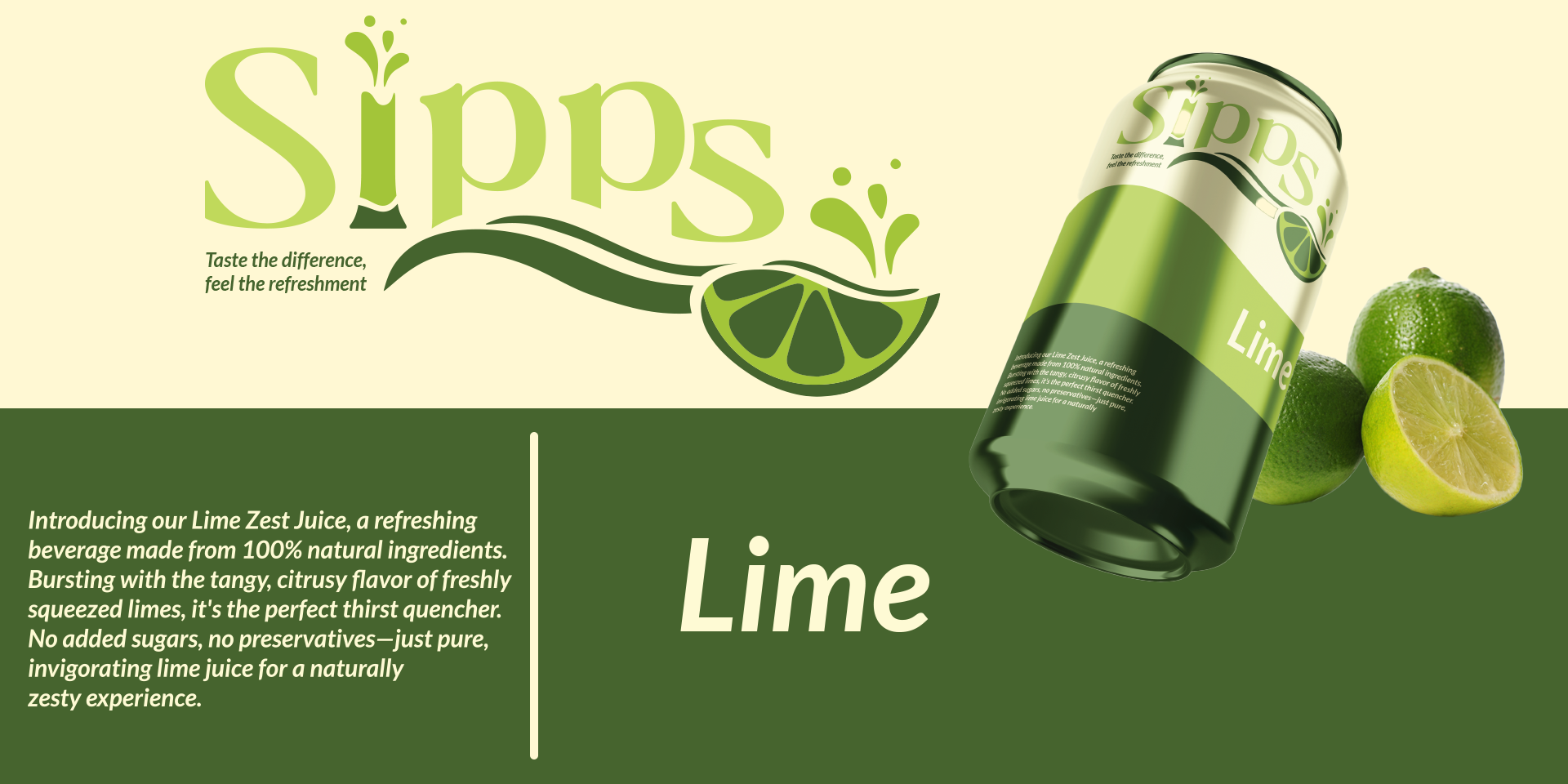
Presenting Sipps, a wonderful collection of beverages meant to quench your thirst and awaken your senses, crafted from the finest natural ingredients.
Statement
The Challenge
Sipps needed to stand out in the crowded beverage market by creating a brand identity that conveyed freshness and natural quality while appealing to a broad audience. The goal was to capture the essence of vibrancy, refreshment, and natural goodness in a visually distinct and memorable way.
Approach
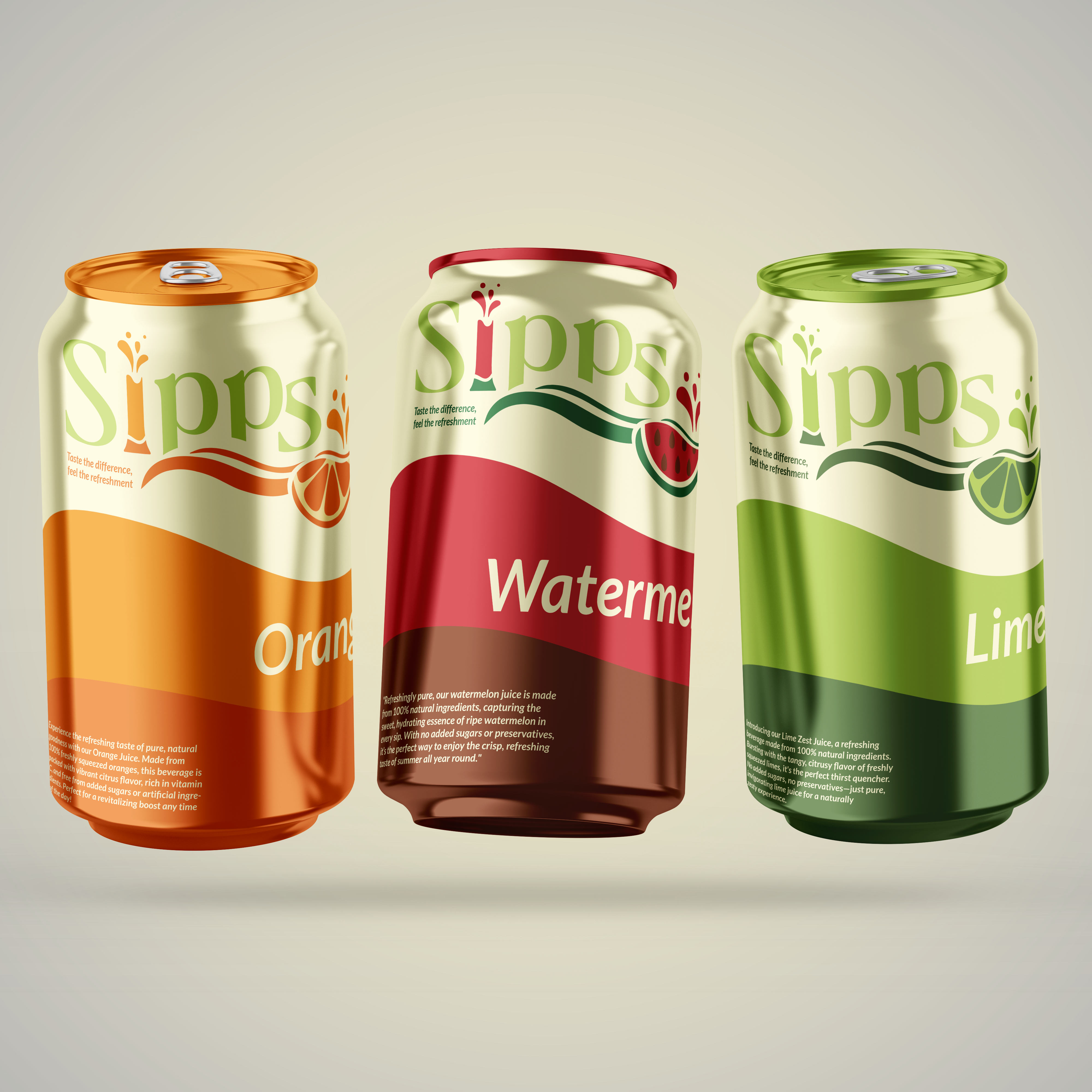
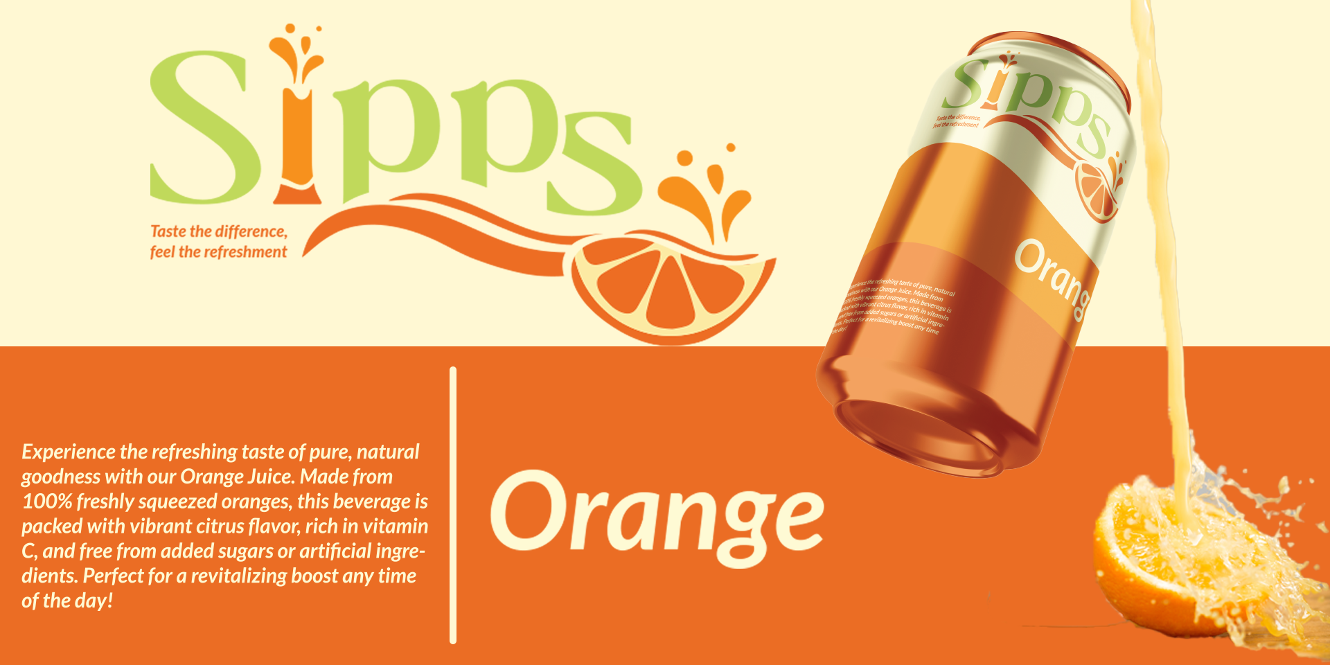
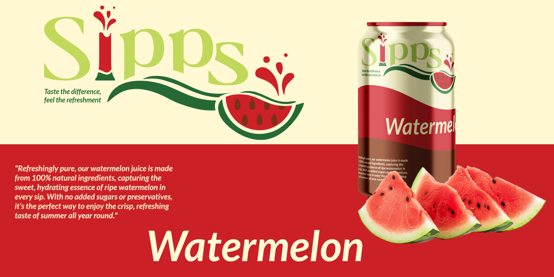
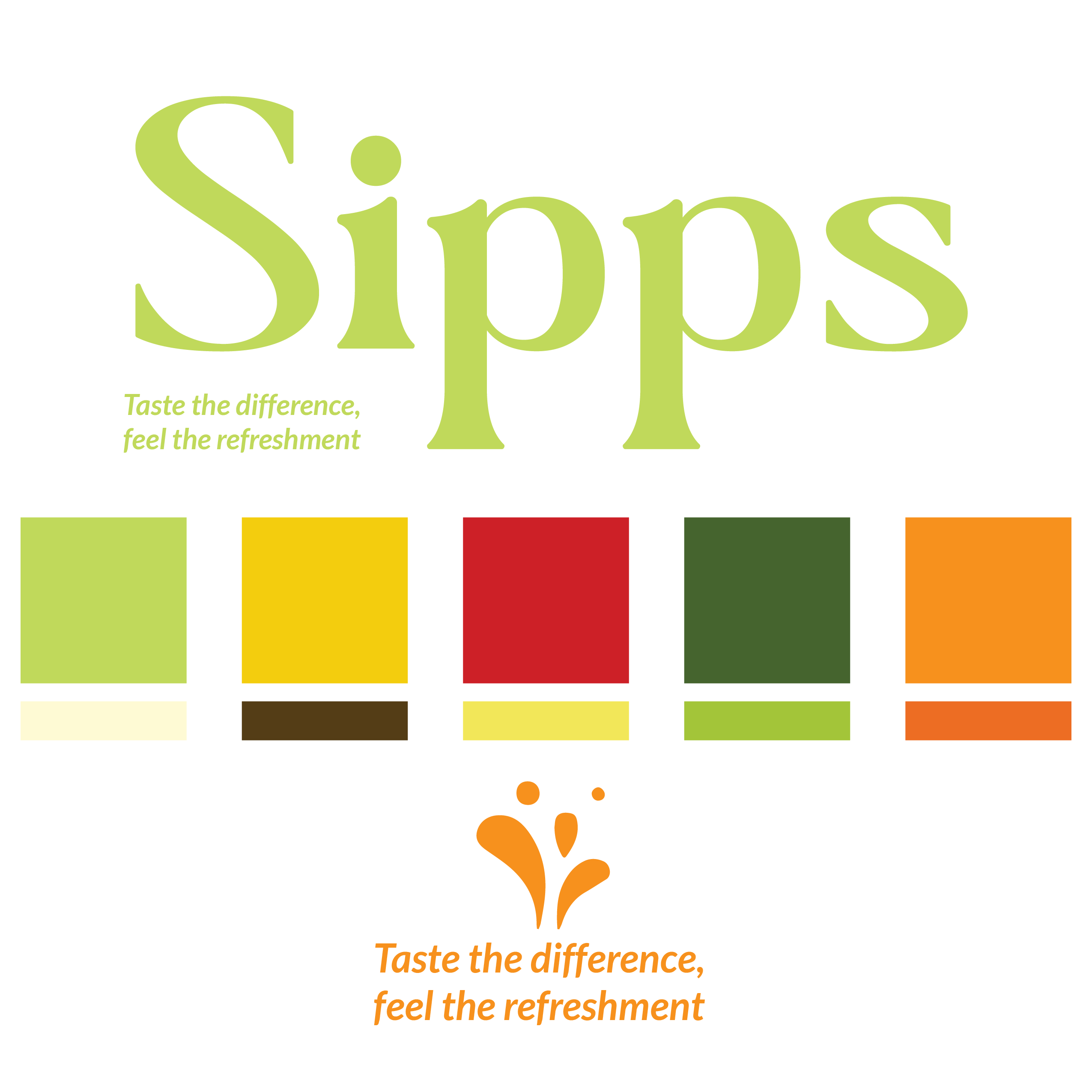
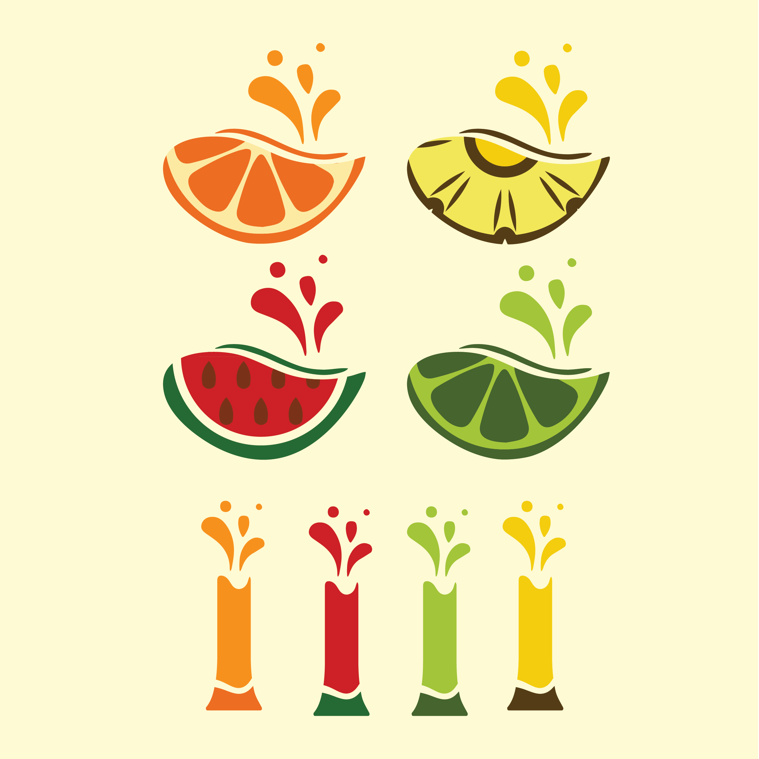
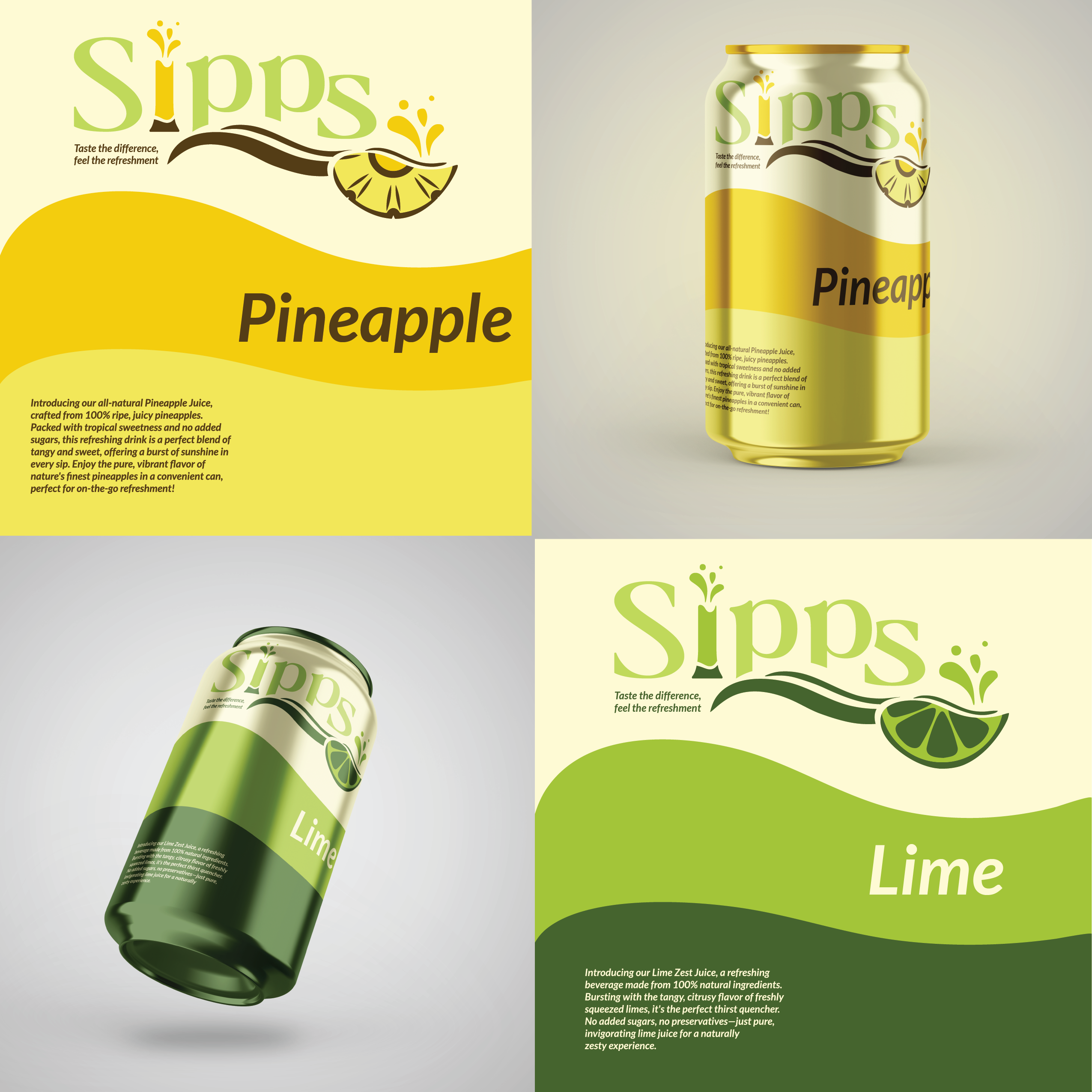
The design approach used bright, natural colors and playful elements like wave patterns and splash motifs to symbolize refreshment. A bold, friendly typeface was chosen for the logo, integrating splash imagery to reflect Sipps' energetic personality, with fruit imagery and color schemes to connect with each flavor.
Solution
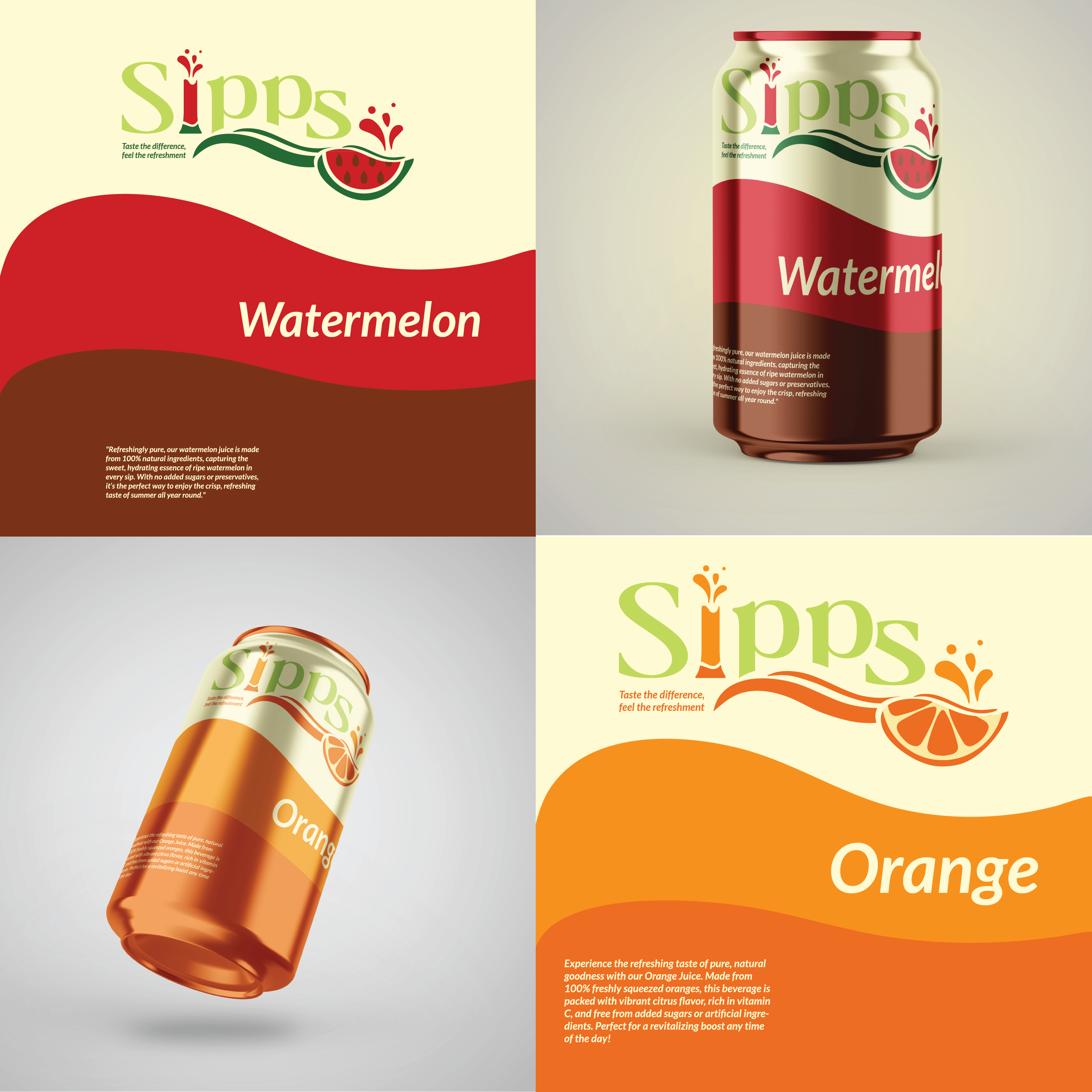
The final brand identity for Sipps effectively communicated refreshment and natural appeal through a vibrant logo and cohesive packaging design. The playful and distinct visuals, along with the tagline "Taste the difference, feel the refreshment," ensured Sipps stood out on shelves and resonated with consumers seeking a lively and invigorating beverage.

- Made a short clip animated for each flavor of Sipps that may be used in advertisements.
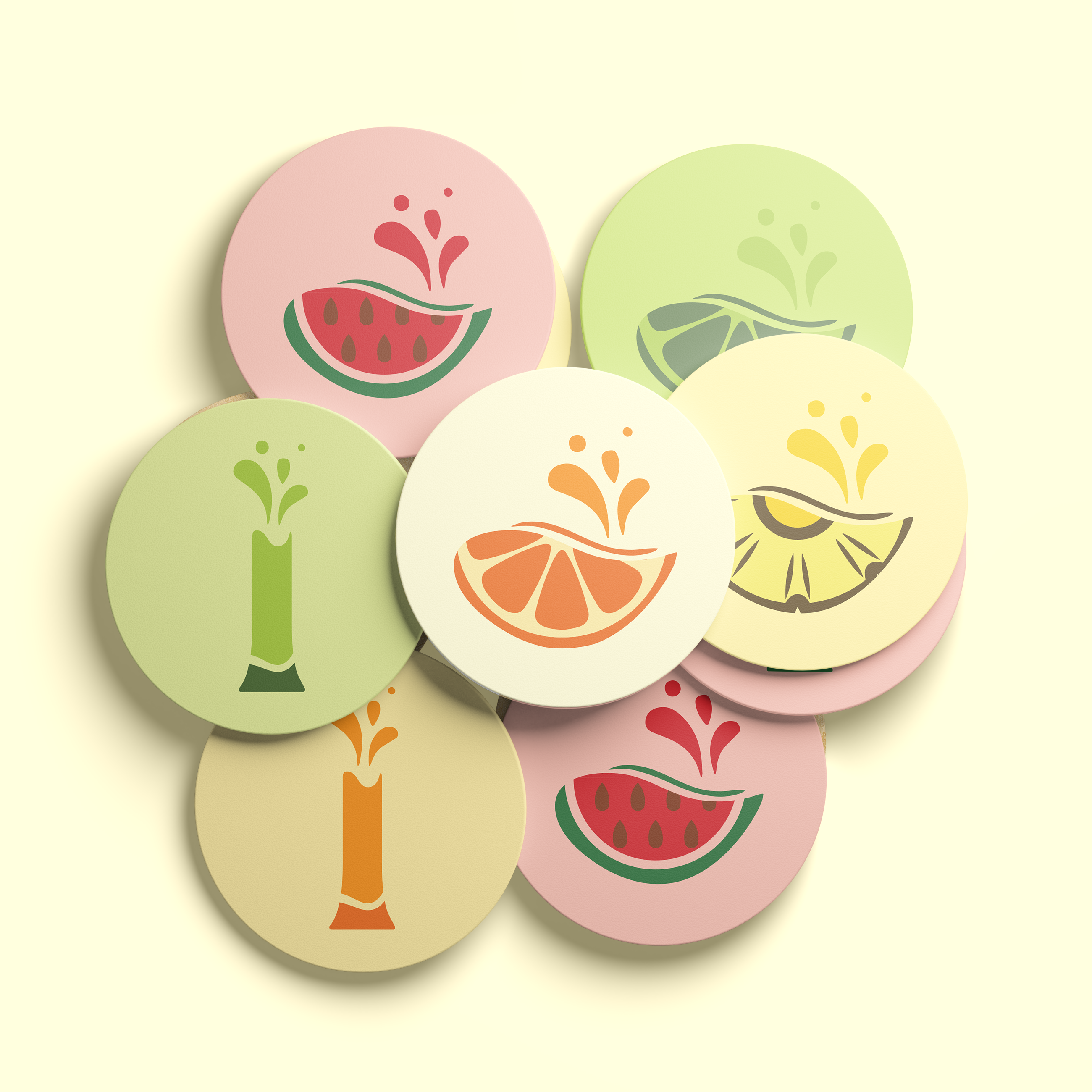
- Designed drink coasters with graphics that change based on the flavors.
- Every taste is intended to offer a distinct experience while adhering to the brand's values.
